Introduction
If the goal of your website is to attract new customers, it should be designed in a way that encourages conversions.
Design With Intent
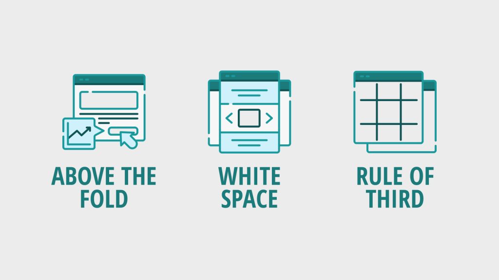
UX design principles can help create websites that result in higher conversion rates. Let’s explore some of the key UX-focused principles for creating websites that convert, including what to put above the fold, how to use whitespace, and the rule of thirds.
Elements Above The Fold
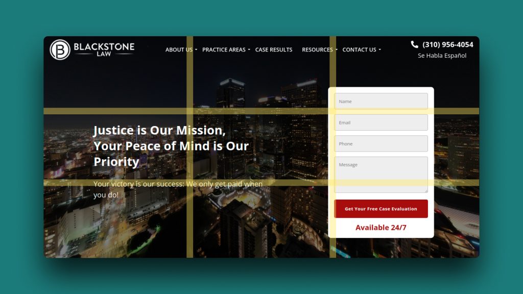
The “fold” refers to the area of a web page that can be seen without having to scroll down. By making sure that all of the most important features of your website are visible at the top of the page, visitors will have a better experience from the start.
It’s important to make sure that elements which are essential to the user experience are visible and easily accessible in this area. For example, including a submission form at the top of the page can help encourage visitors to take action right away. Utilizing visuals such as images, videos, or infographics can help draw the eye to key points of interest.
If a user has a positive experience with these elements above the fold, they’ll be more likely to continue exploring the site.

Thoughtful Whitespace
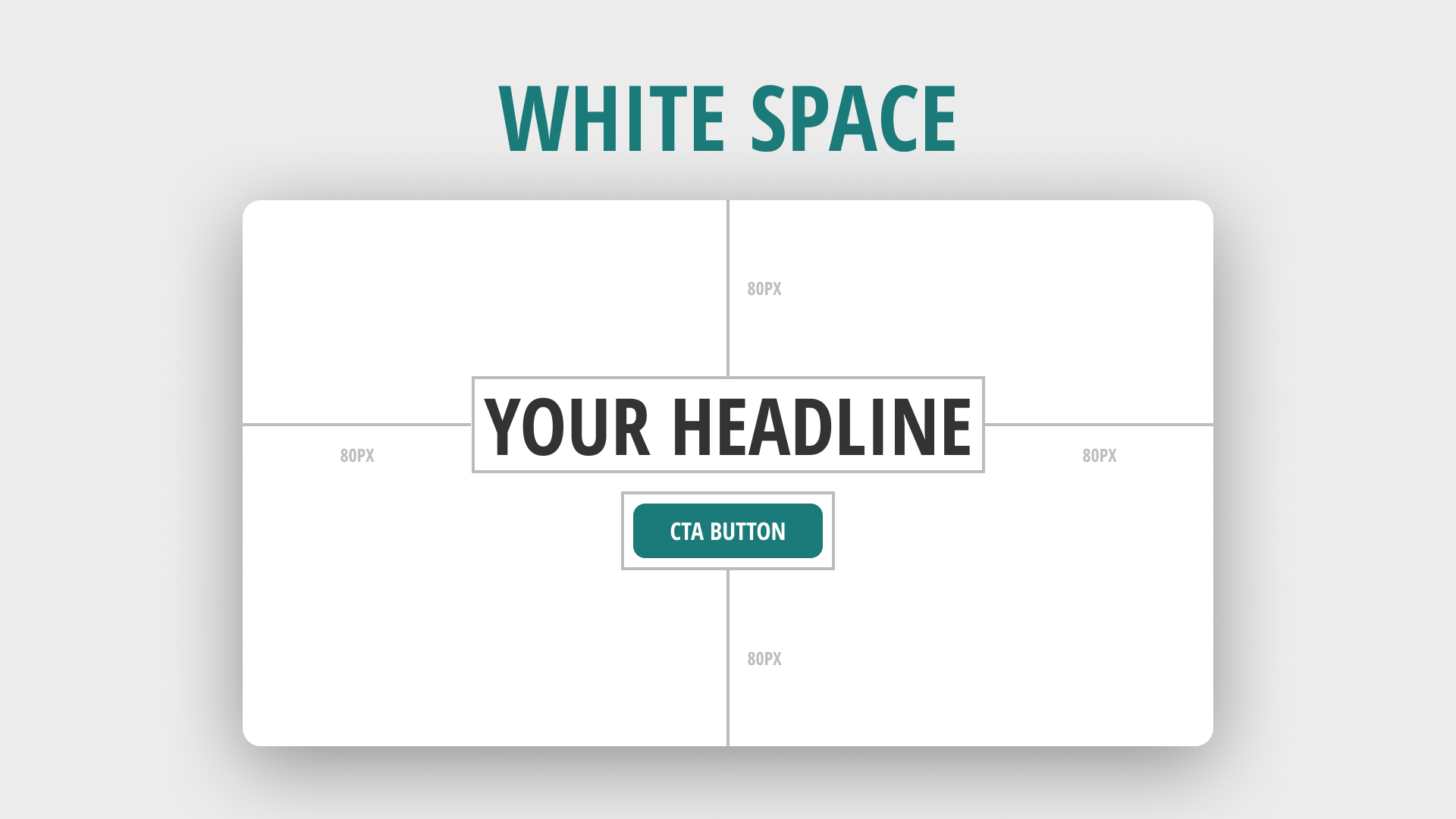
White space is an important element of web design. When used properly, it can create a sense of harmony and balance, as well as draw attention to key elements on the page. The use of whitespace helps guide users through a page by visually separating different sections, making it easier to scan and navigate.
The size of margins and padding also plays a role in creating an effective layout. Using too little white space can cause a page to feel cluttered while using too much white space can make the page appear empty and uninteresting. By using moderate amounts of whitespace, you can make your site look more professional and inviting.
White space isn’t just about aesthetics—it’s also about functionality. Increasing the space around clickable elements such as buttons can make them more visible and easier to tap on mobile devices.
The Rule Of Thirds
The rule of thirds is a composition technique that involves dividing an image or page into nine equal parts, where the intersections of the lines are considered the focal points of the page.
Using the rule of thirds can help make your website easier to read and understand. When used correctly, it will lead users through the page in a logical and visually pleasing way. For example, when designing a website, you can use the rule of thirds to create a grid that divides the page into sections. This allows you to organize content in a way that makes sense, while still allowing for visual interest and engagement.
Using the rule of thirds can help create a visual hierarchy on your page, with the most important elements placed at the focal points of the grid. This makes it easier for users to identify and interact with key elements on your website.