INTRODUCTION
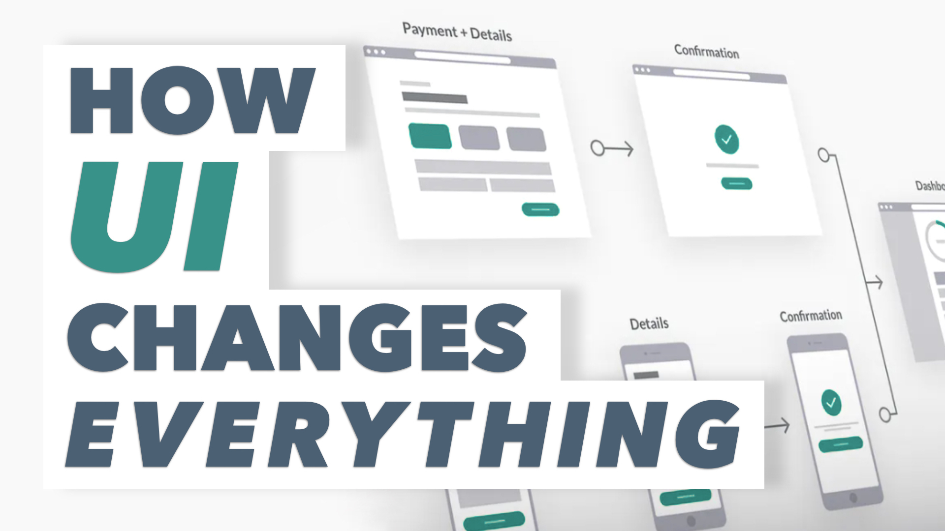
The User Interface, or “UI”, of a website can make or break your business. You can have the best product in the world, but it’s worthless if it’s inaccessible. An improved UI can convert traffic into customers, and visitors into users. Here are 5 quick tips you should consider to improve the UI of your website:

1. Know Your Clientele
The first step in having a successful website is knowing what kind of customers you’re attracting. Knowing your clients means knowing demographics, studying trends, and then applying those to your website. It’s key to find a genuine way to mirror your client. You have to show your customers that you are a good cultural fit. Creating a feeling of authenticity is the first step in developing a relationship with your customers. Building a relationship with your customer can help them feel good about doing business with you.
2. Be Welcoming
We all know how important first impressions are. Far too often we visit a website and are bombarded with flashing banners, prompts, and videos. This is not the way to make a good first impression. It’s imperative that you make your visitors feel comfortable, because otherwise, they’re going to leave, and they probably won’t be back. So, it’s crucial that the welcome page is just that, welcoming! A welcome page that’s easy on the eyes will avoid overwhelming the user. Conversely, forcing someone to make an account, or click through excessive windows or tabs that expand across the page unexpectedly, is a sure-fire way to scare them off.


3. Easy Navigation
If the user can’t find what they’re looking for, there’s no chance of a conversion. It’s that simple. Having a website that is easy to navigate is key to being successful. That means an interface that is easy to navigate, and easy to learn. Know your client’s goals, and design around them. Remember, less is more. Easy navigation also means maximizing accessibility. With more and more businesses moving online, it’s important to make your content accessible to as many people as possible. Both people with and without disabilities will appreciate this effort. When customers can find what they’re looking for, your business converts.
4. Be Consistent
To be successful you need to be reliable, and to be reliable you need to be consistent. Someone who visits your website shouldn’t be having a different experience on each page. Consistency across the website will create a sense of congruency, and a linear experience for the user. This can be achieved by keeping in mind color, font, formatting, images, branding, and the overall aesthetic of the website. Being consistent will give your website an identity, and make it more easily recognizable.


5. Give Feedback
Finally, be sure to provide the user with feedback. Whether they’ve made a purchase, signed up for a newsletter, or shared a post, let them know they’ve completed that action. This creates a conversation between your website and the user, and lets them know that their inputs are producing outputs. Giving feedback will put the user at ease, and helps to facilitate a more personal experience by ensuring that the website is listening to the user.
It’s that simple! Consider these 5 tips, and apply them to your website. By doing this, you’ll help maximize the conversion potential of your business, and improve the lives of your customers.