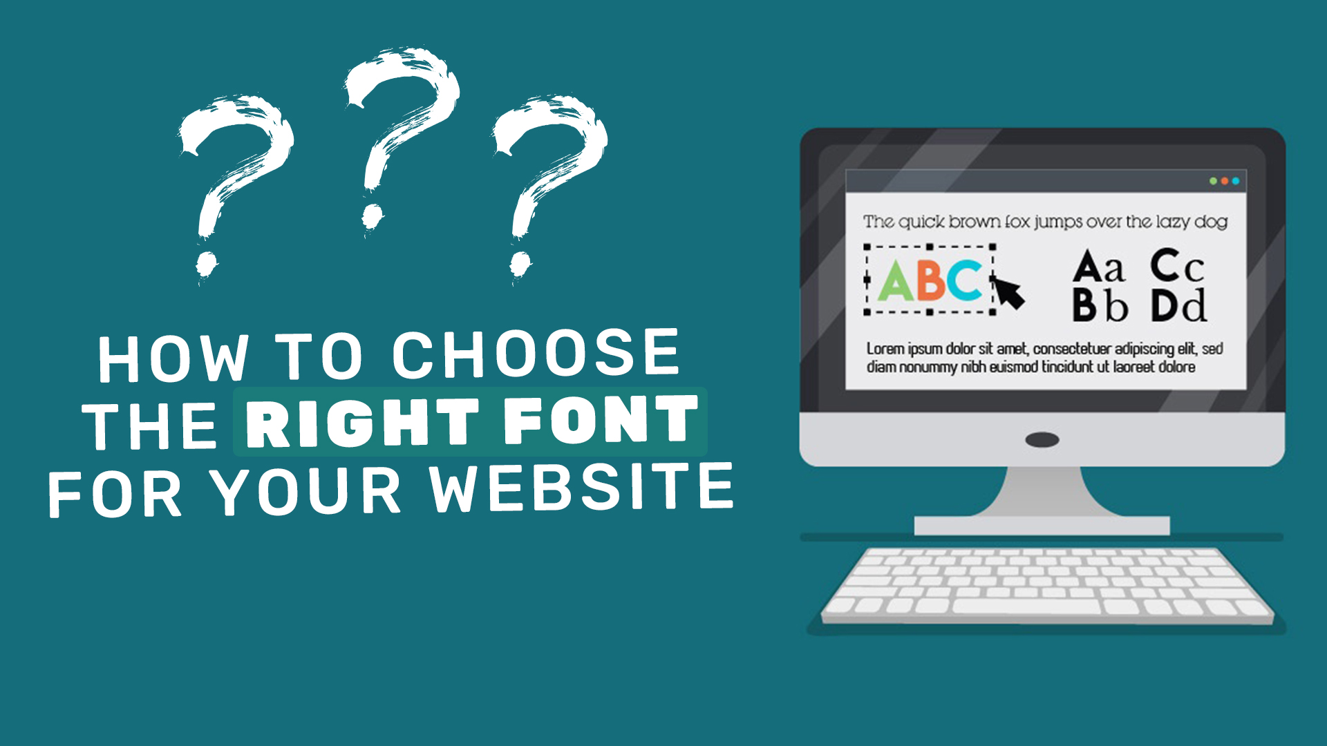
Introduction
Typography is one of the key elements in the branding aesthetics. How you present yourself in font choices is a subtle art in telling viewers and customers the personality of your company. And with thousands of fonts online, from free ones to Adobe to ones you pay for, which one is right for you and your brand?
Typography has always been easy to overlook or to overthink. In working with many businesses, we’ve found a few guiding principles and ideas to guide each unique brand.
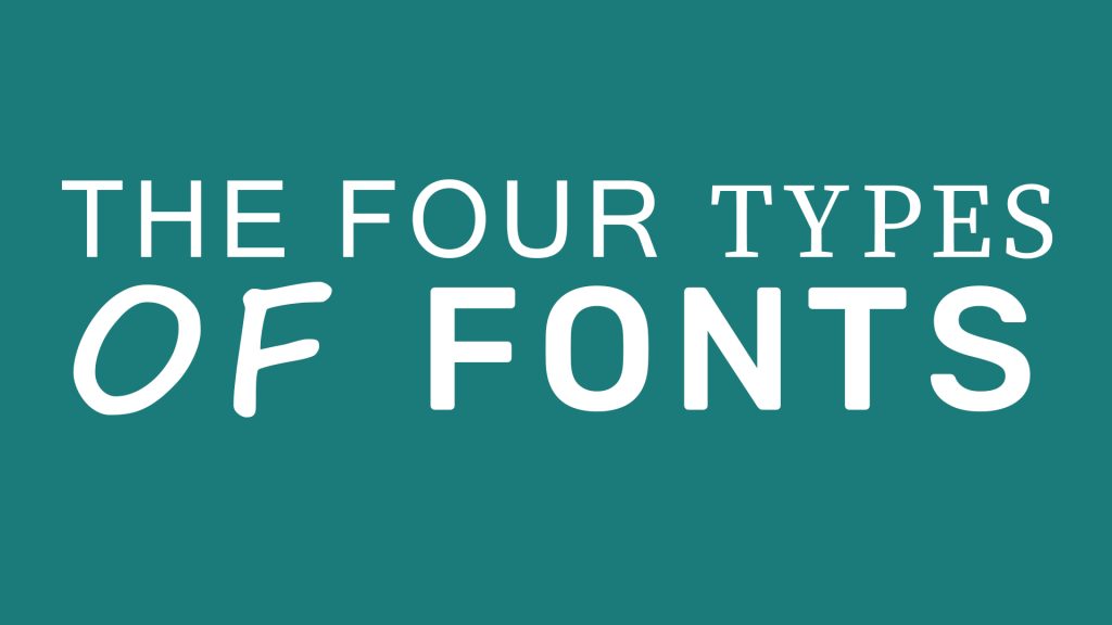
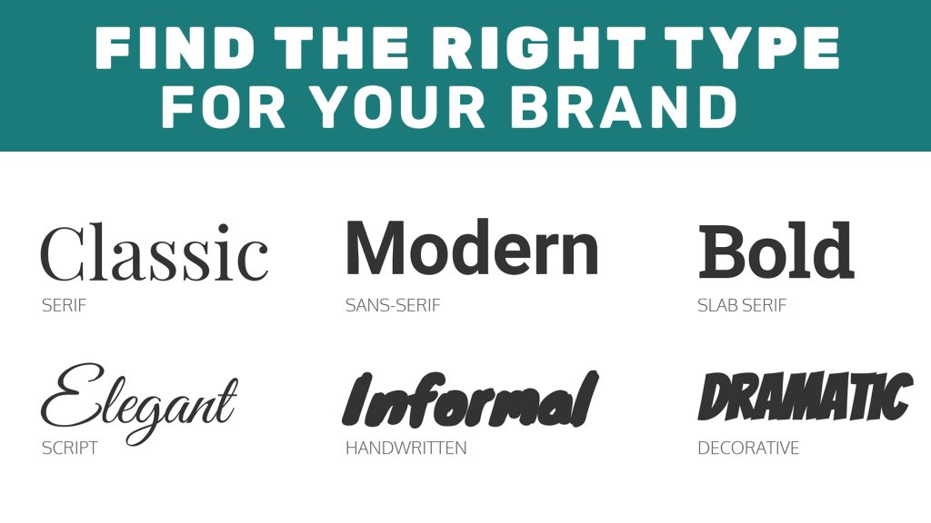
The Four Types Of Fonts
Choosing fonts is one of the more exciting things to put on your website. As we’ve mentioned, there are far too many options, so we’ve divided the massive body of fonts into four major categories:
- Serif: These fonts say more traditional things about your brand. There’s an inherent professionalism, but with a dash of old school and literary taste.
- San serif: These lend a modern and minimalist look to your site and brand. Depending on the shape, they can look stark and serious, or friendly and welcoming.
- Script: A more boutique look comes from script fonts. They are elegant and somewhat effeminate, great for wedding sites and quaint brands.
Display: Display fonts come in a massive variety of shapes, sizes, and even gimmicks. These should be used sparingly, and it’s easy to get bedazzled in all these options.
Pairing Fonts Effectively
We’re all about bending (and sometimes even breaking rules), but you have to know the rules well enough in order to make sure they don’t snap and blow up in your face. There are some great rules about matching fonts we like to follow:
- Rule Of Two. Choose only two fonts for your site. Sometimes you can get away with a third, but don’t go overboard in picking too many fonts.
- Pair a serif with a san serif. A classic rule that states you should match a serif or san serif heading with the body of the opposite. People break this one all the time. But, when in doubt, this is a great one to abide by.
- Assign roles for each of your fonts. Have a body font and a header/subheader font. This will help establish a hierarchy of information in your website and help readers navigate the content effectively.
- Contrast weights and sizes. This can further the hierarchy on your site.
Remember, it’s all about information and personality. These rules are great places to start to build out your site’s font selection while maintaining what’s important: the message in your branding core.
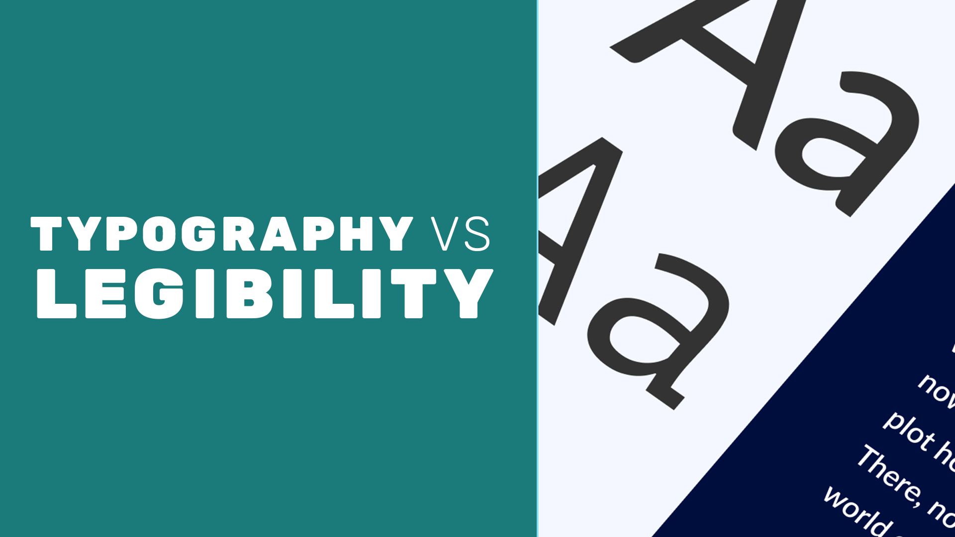
Typography vs. Legibility
A big problem we see is people getting too far into the design and forgetting the original purpose typefaces and fonts: to be read. Legibility needs to be a huge factor in deciding what font you are picking. A light font weight may look cool, but will it show up on mobile screens? Will the colors I’m picking clash with the font’s overall readability?
Legibility needs to be one of the larger goals when it comes to balancing your typography selection, and nobody wants their brand’s message to be illegible.
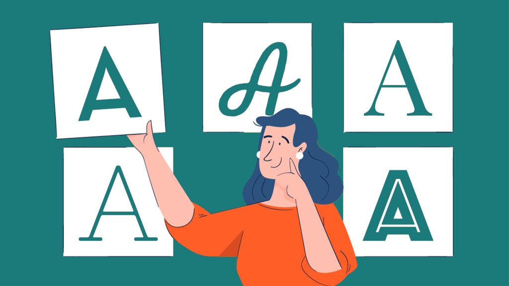
Find The Right Type For Your Brand
If there’s any piece of advice we like to give from our experiences, it’s two big things:
- Don’t go for the over-the-top gimmicky and novelty fonts. They age terribly and never usually say the right things about your brand.
- Pick the subtle font. Typography can work in tandem with the entirety of your branding, and the typefaces and fonts are an opportunity to to be subtle about what your brand is about.
A Final Word On Type
A big problem we see is people getting too far into the design and forgetting the original purpose typefaces and fonts: to be read. Legibility needs to be a huge factor in deciding what font you are picking. A light font weight may look cool, but will it show up on mobile screens? Will the colors I’m picking clash with the font’s overall readability?
If you hit the first page of Google results, you’ll get a lot of noise and clashing advice. Ultimately, it’s your brand that drives your typographical selection, so don’t get caught up in the fonts and typefaces without considering what fits your business best.
While this guide is a great place to start, typography encompasses so much more. Our designers are well-versed in the nuances of typefaces and what they say about your brand, and working with our firm will help you make the best choices for your online presence.
Legibility needs to be one of the larger goals when it comes to balancing your typography selection, and nobody wants their brand’s message to be illegible.