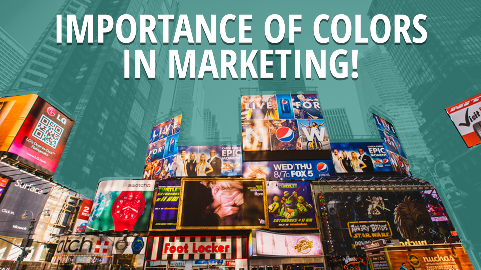
Do Colors Really Influence Your Customers And Audience?
You will think of a certain color when you are in a particular mood. Research shows that color does have an impact on our mood and perception. Colors can trigger a stream of emotional changes in marketing.
Website designs thrive on this knowledge of color psychology. Apart from being similar to the logo color, the theme colors on websites are also psychologically inclined. Haven’t you ever noticed that certain buttons on websites are always featuring a certain color?
In marketing, some of these colors have become widely known and used as substitutes and not on the whole page.
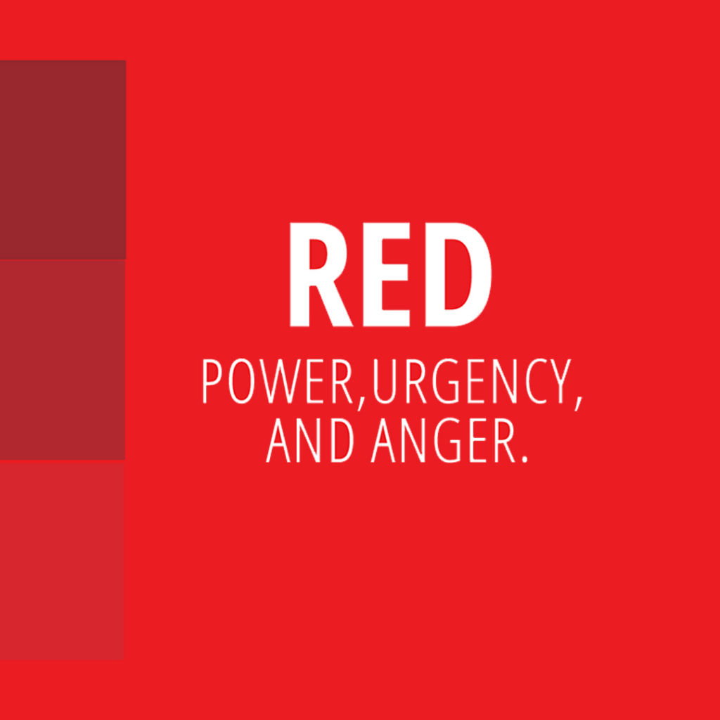
The red color is associated with power and urgency, as well as power and anger.
It’s only reasonable to want to be careful around red, especially when using it on a website design. Use sparingly if you need to use the shade.
In sales, red is responsible for pushing visitors to action.
For instance, after an excellent pedigree, impressive design, and mouthwatering offer, your call to action button can be set in red color.
This will create a sense of urgency in customers.
Consequently, when you see the color red in action during clearance sales and promo sales then it creates the sense that you must take action like buy or check out the sale right away. Black Friday sales advert is also set in red to give you that sense of urgency to buy the deals.
Your goal is to attract people to your store instead of the other. Your sales sign should be bright and scream importance.
The Color Psychology Of Blue
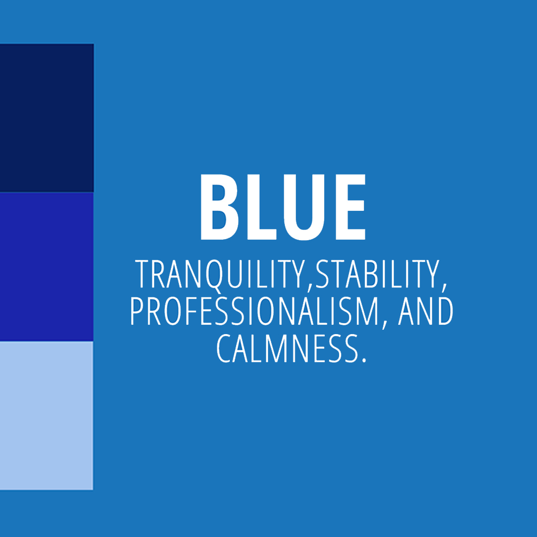
The blue color is synonymous with tranquility, stability, professionalism, and calmness. This is why blue is popular with financial institutions.
This shade is associated with trust and security which comes in handy when trying to sell an item at a higher price.
The blue color has a way of boosting sales indirectly. This is usually done by quelling anxiety ahead of time. In contrast, the red color works by triggering the nervous system and raising tension. Blue does the exact opposite of this and triggers sales by calming you down and increasing trust levels.
It’s an excellent choice for websites which sells utilities like medicine, insurance, or finance. It is usually used as the background of these sites and also conversion elements like call to action (CTAs).
You will find the color blue on most insurance and financial sites like PayPal. Their intuitive UI team, uses light blue shades to represent security and freedom and dark blue shades to indicate a sense of intelligence and tradition.
However, navy blue and royal Blue could also be used by financial industries to provide a sense of sober security.
Blue curbs appetite and promotes productivity, while signifying peaceful nature such as water and clouds. However, just like other colors, it should be used sparingly to avoid the brand coming off as unfriendly or cold.
You can use blue color against a white background as a conversion element; pair a lighter and darker blue shade to provide a more readable text.
Fun fact: This color is visible for people who are red-green colorblind as they can easily see blue.
The Color Psychology Of Green
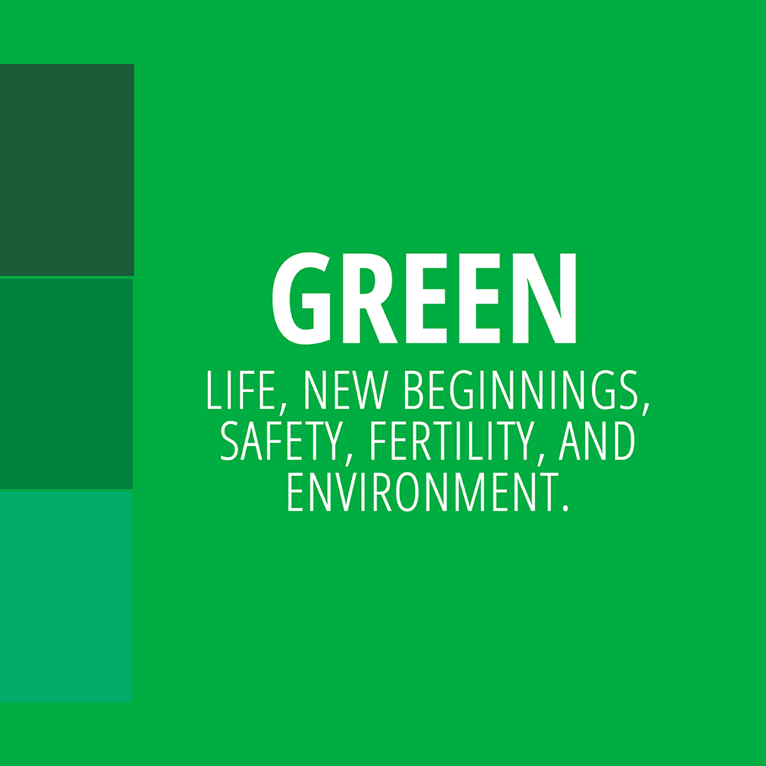
Green is related to the environment, used to represent natural and organic items. Green is nature’s favorite color (if nature does have a favorite color). Green is associated with the season of spring, life, new beginnings, safety, fertility and environment. This is the color that stands for continuous growth. Undeniably though, it has a healing effects to us, both physically and emotionally, and is known to have a soothing effect to human vision. Since it takes dominance in the natural world, green takes a lot of space in the human eye’s spectrum. It’s an ideal design color because its found to be featured everywhere in nature.
This shade appeals to everyone who loves what this color is subconsciously synonymous with. This color makes people more creative than their counterparts as it is associated with tranquility. It triggers harmony in the brain and aids decisiveness by creating balance.
Green conversion elements encourage purchases by making it seem to like permission rather than urgency.
If red is used to indicate special offers, if blue is used for dominating the page, and green should be used to convey a conversion element all on a white background.
This color is best used in contrasting colors and white spaces. It can also blend into sites where it is the primary color without being too loud. Green buy buttons are the best option if you would instead give your visitors the green light as if saying “go ahead!” rather than a red alert sale.
The over usage of green could signify moodiness and depression, so all designers should beware of not over-saturating your site with green. Moderation is advised when using the color on your brand.
Final Thoughts
In short, colors can affect purchases and using certain design colors can transfer these emotions to readers.
Knowing how to harness the amazing properties of colors and use them to advance purchases is one well-kept secret that can be helpful to your brand.
The best way to do this is to align your brand with colors that will represent your brand accurately. Few colors have been said to be perfect as CTAs, it is still important to understand the context that the color applies and experiment with it. Remember to run personal tests on these button colors to know what works more with your brand.