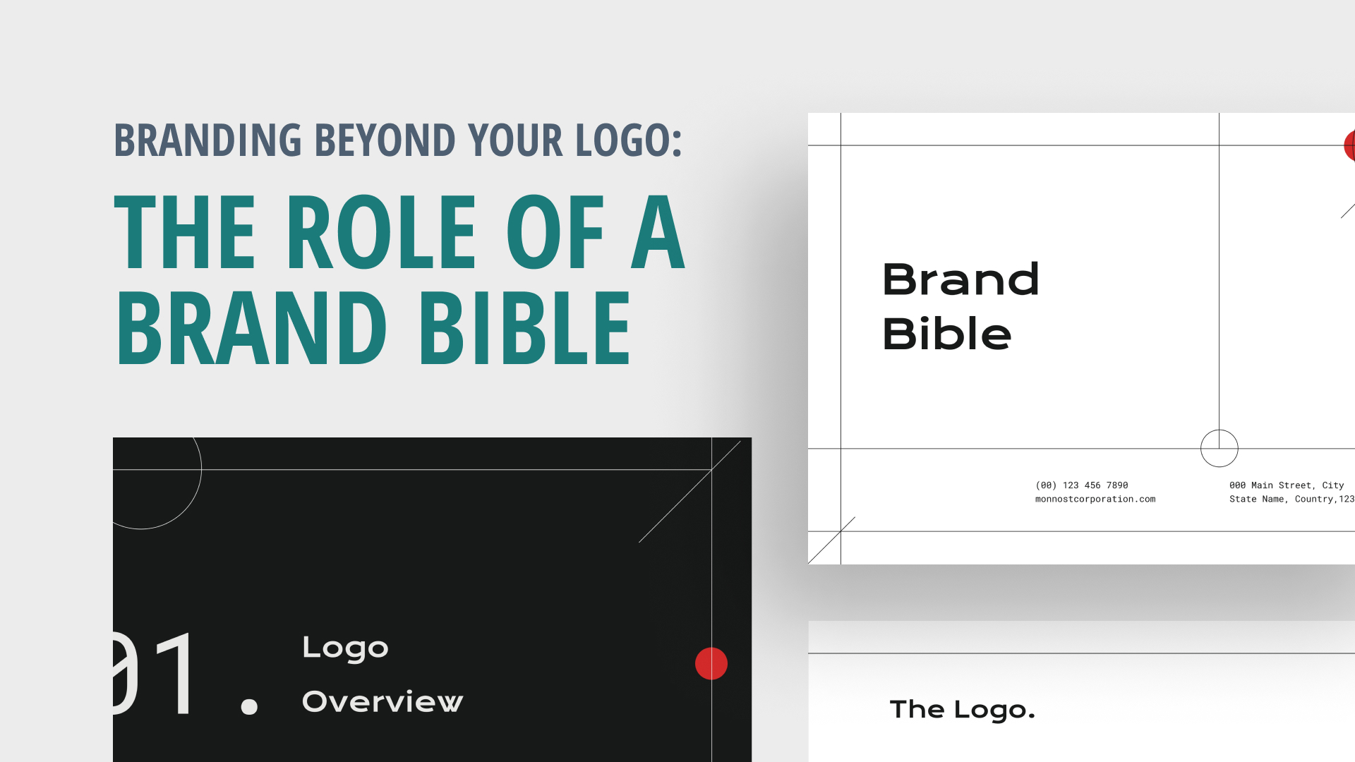
Introduction
Give Your Team the Tools They Need to be Brand Ambassadors

A brand bible is a document that defines your brand’s purpose, values, personality, and visual identity. It’s a tool that helps ensure consistency across all brand touchpoints, from your logo and website to your social media profiles and advertising campaigns.
Having a brand bible can make a big difference in your digital marketing efforts. It helps you create a more cohesive and memorable brand experience for your audience, and ensures that your messaging is consistent and on-point. It also makes it easier to onboard new team members and partners, as they have a clear understanding of what your brand stands for and how to represent it.
Key Elements to Carefully Consider
There are a variety of templates you can use depending on your needs. Here are four basic necessities of any brand bible:
- Start by identifying what your brand’s mission is and what values it embodies. This will help guide your messaging and visual identity.
- Develop a consistent visual identity that reflects your brand’s personality and values. This includes your logo, color palette, typeface, and imagery.
- Determine how your brand speaks to your audience. Is it casual and conversational or formal and authoritative? This will help guide your messaging across all channels.
- Consider your audience: What needs, interests, and behaviors lead them to your brand?
Remember, keep it concise! It’s a reference guide, not a novel.


Collaborate and Conquer the Competition
Whether your business has five employees or 500, a brand bible can be a powerful tool in your digital marketing arsenal for several important reasons.
CONSISTENCY: Is your brand identity and messaging consistent across all your online channels?
DIFFERENTIATION: Does your brand stand out from competitors and leave a memorable impression?
COLLABORATION: Is everyone in your company on the same page when it comes to brand representation?
By taking the time to think critically about how these concepts relate to your brand, you might find promising areas for development! At EMRG, we love creating these for clients to ensure that our efforts always effectively convey the brand’s unique identity. If you want some help developing your own, let’s talk!
The Rule Of Thirds
The rule of thirds is a composition technique that involves dividing an image or page into nine equal parts, where the intersections of the lines are considered the focal points of the page.
Using the rule of thirds can help make your website easier to read and understand. When used correctly, it will lead users through the page in a logical and visually pleasing way. For example, when designing a website, you can use the rule of thirds to create a grid that divides the page into sections. This allows you to organize content in a way that makes sense, while still allowing for visual interest and engagement.
Using the rule of thirds can help create a visual hierarchy on your page, with the most important elements placed at the focal points of the grid. This makes it easier for users to identify and interact with key elements on your website.
